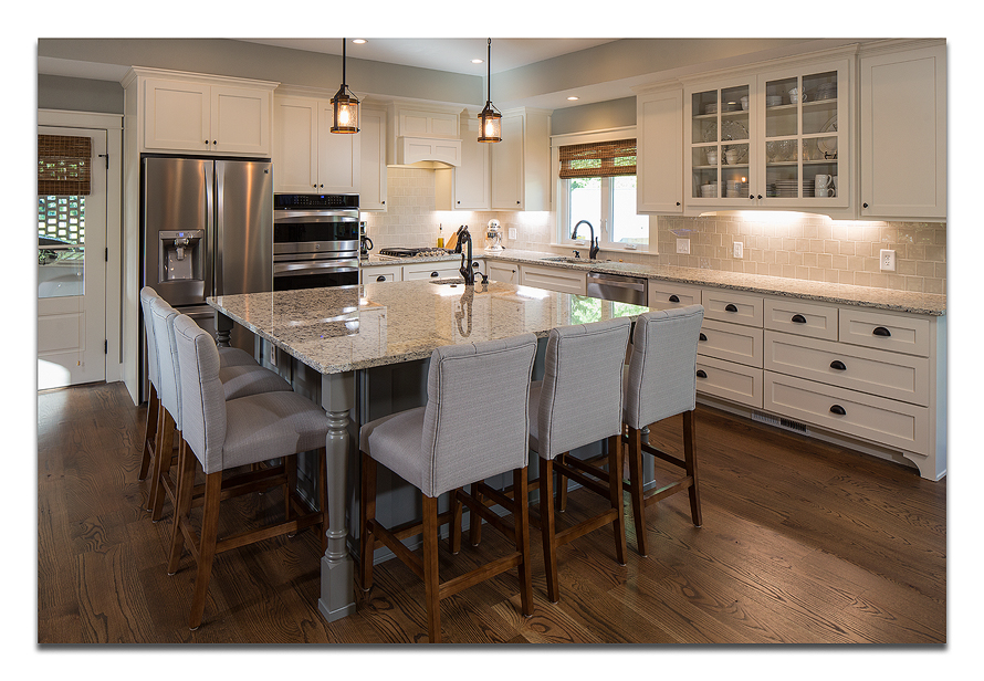
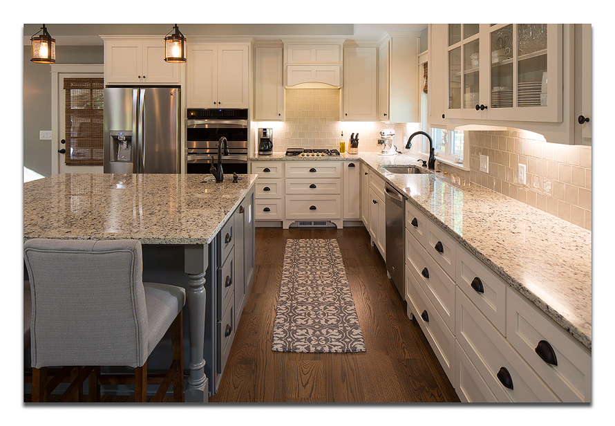
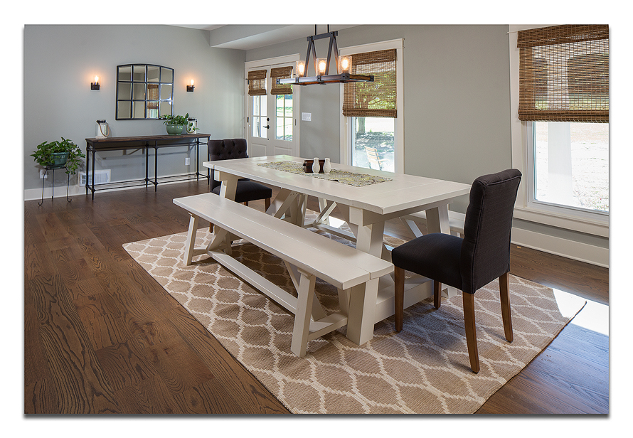
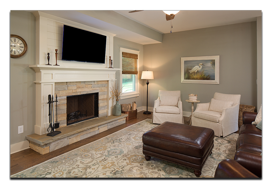
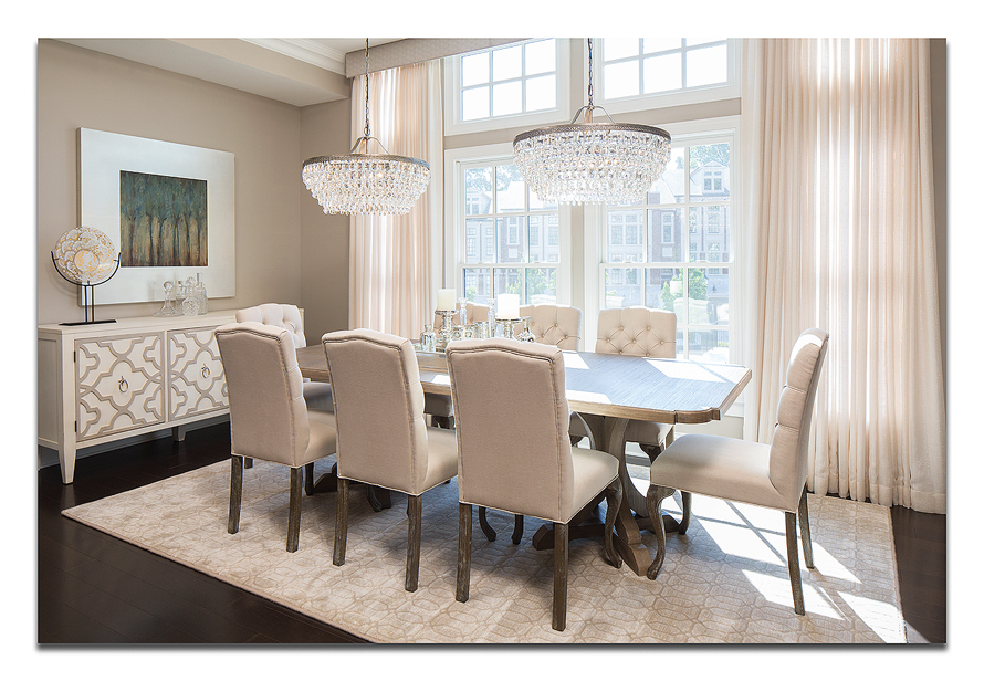
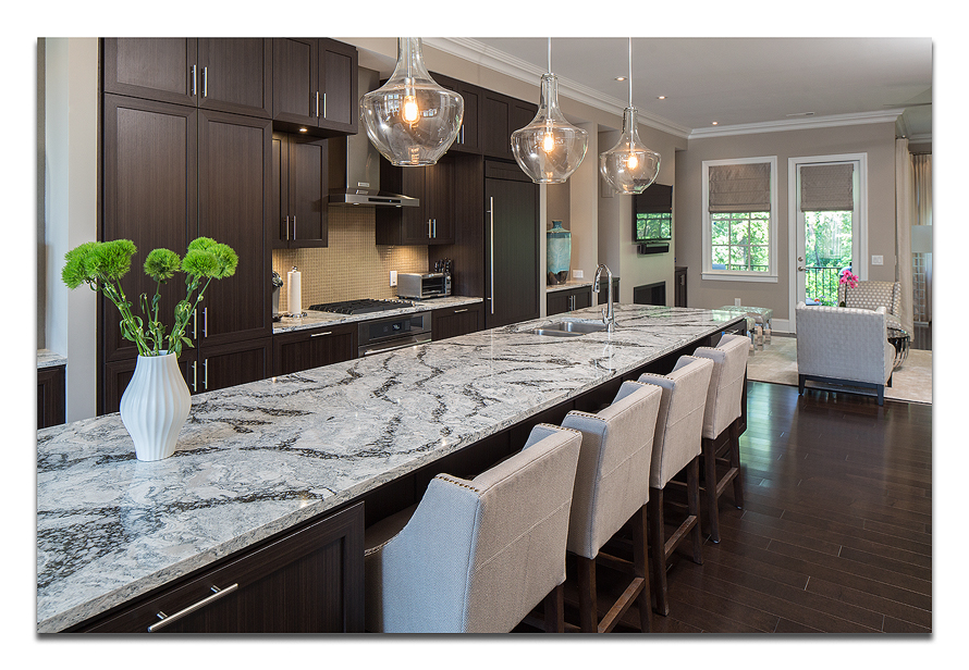
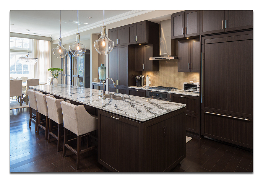
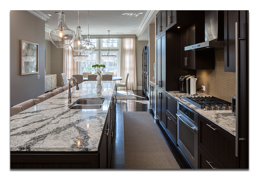
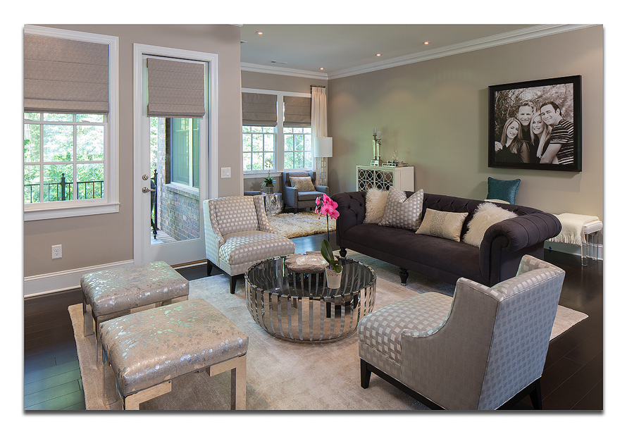
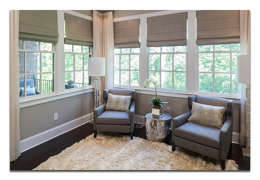
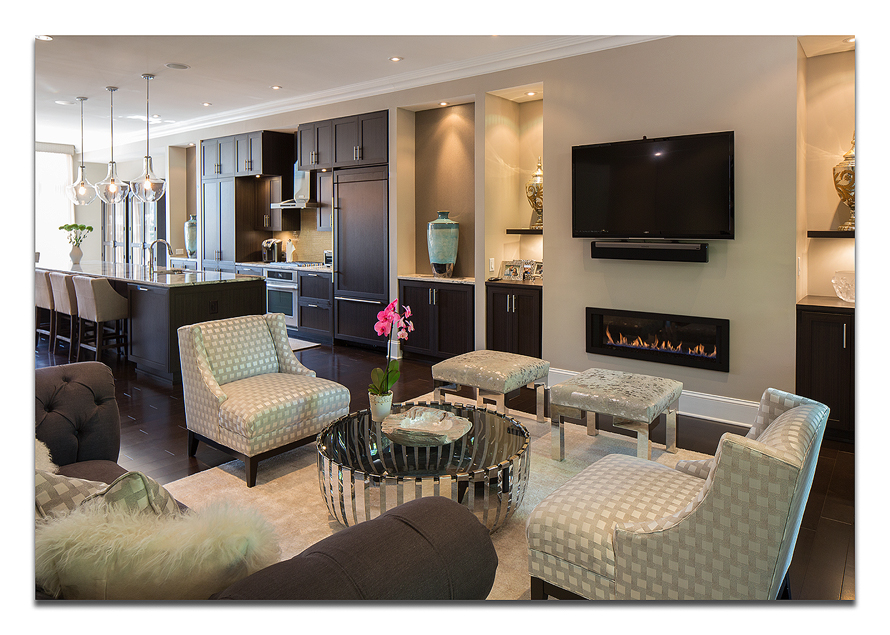
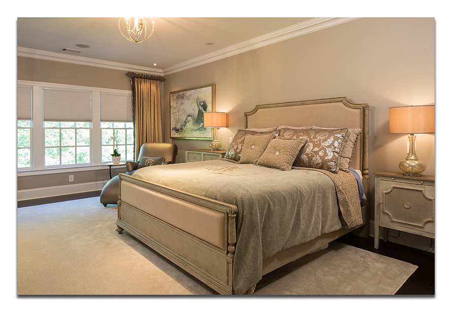
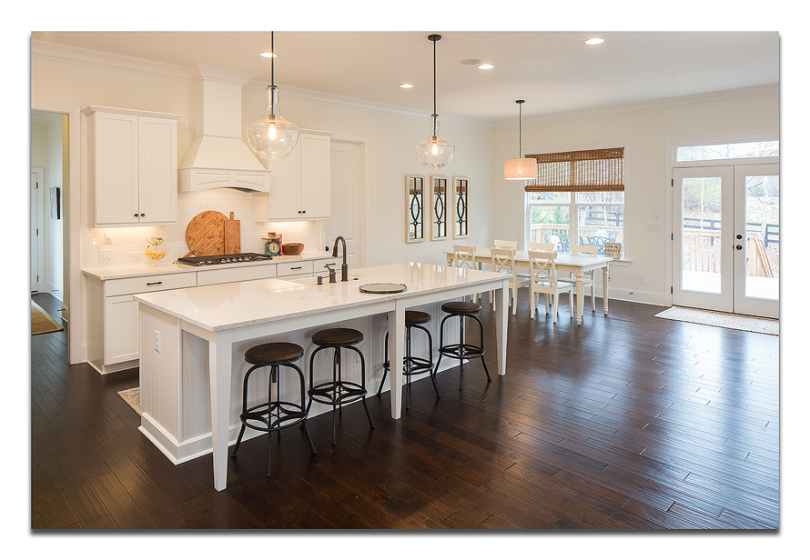
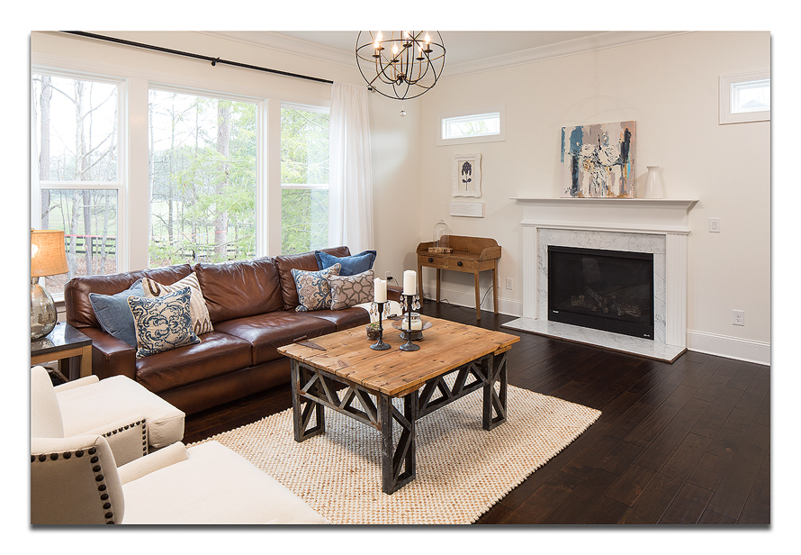
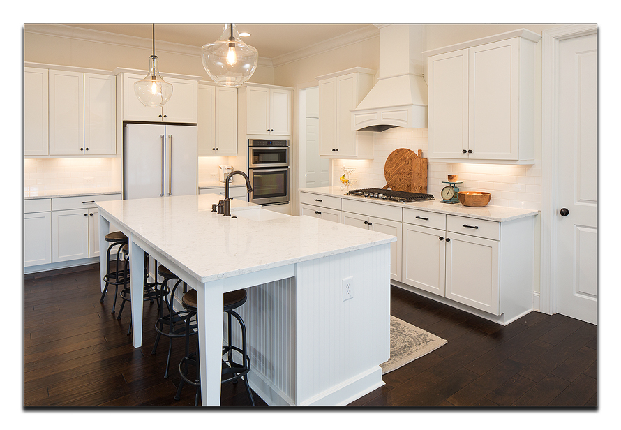
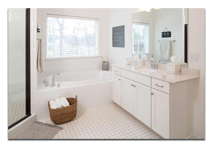
I grew up in a ranch home. A nice, old, brick ranch home. When we bought it, it needed some updating. Little by little, my parents picked a room, and went to work. By the time I went off to college, it was a very comfortable, updated, and well-maintained home that I remember fondly.
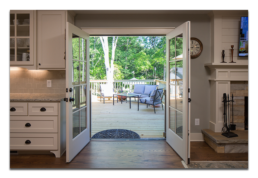
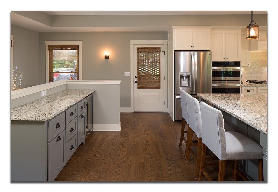
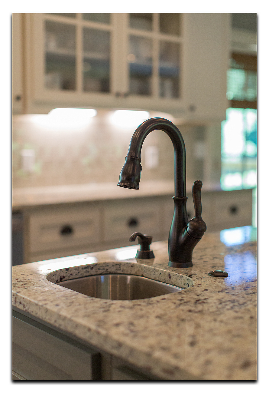
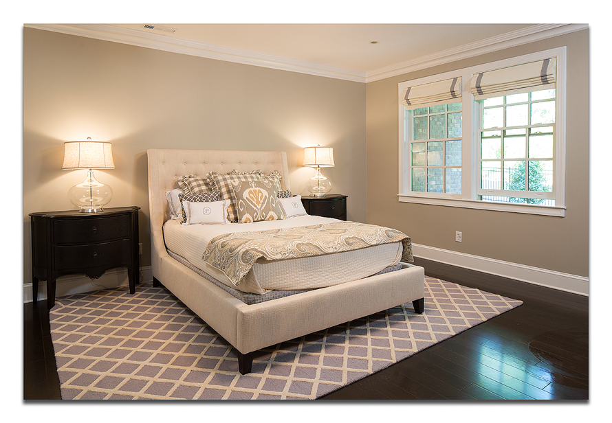
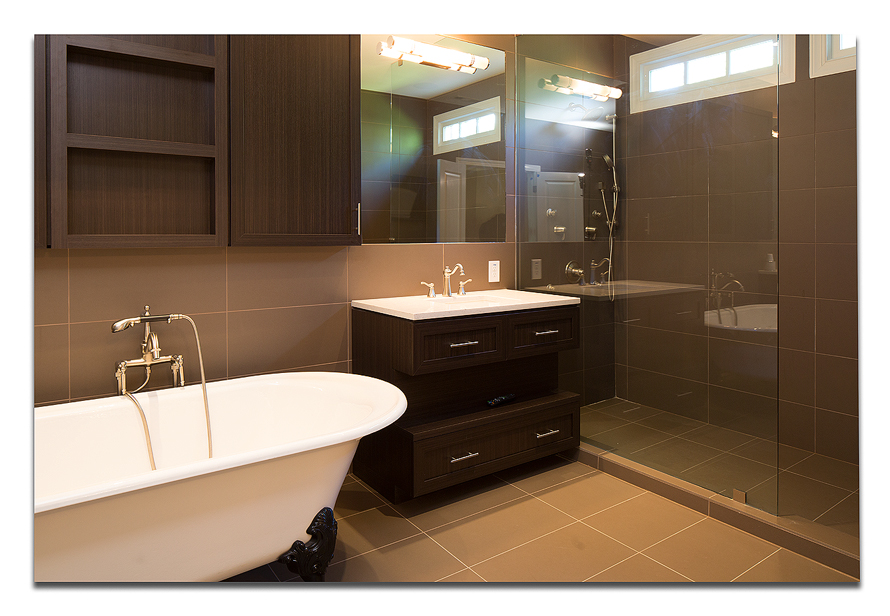
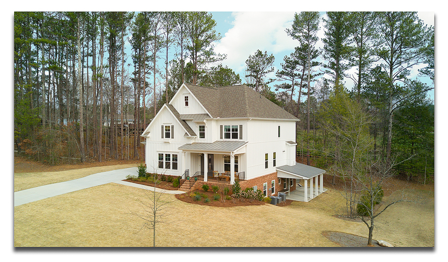
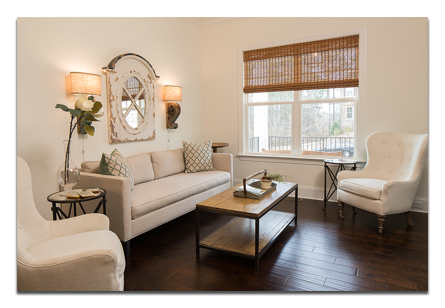
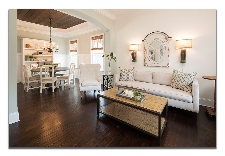
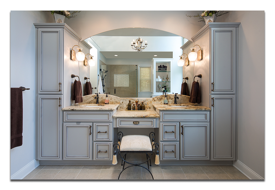
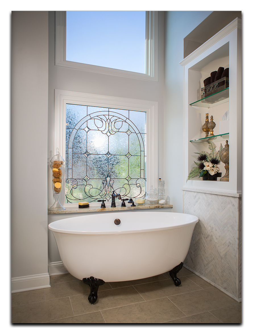
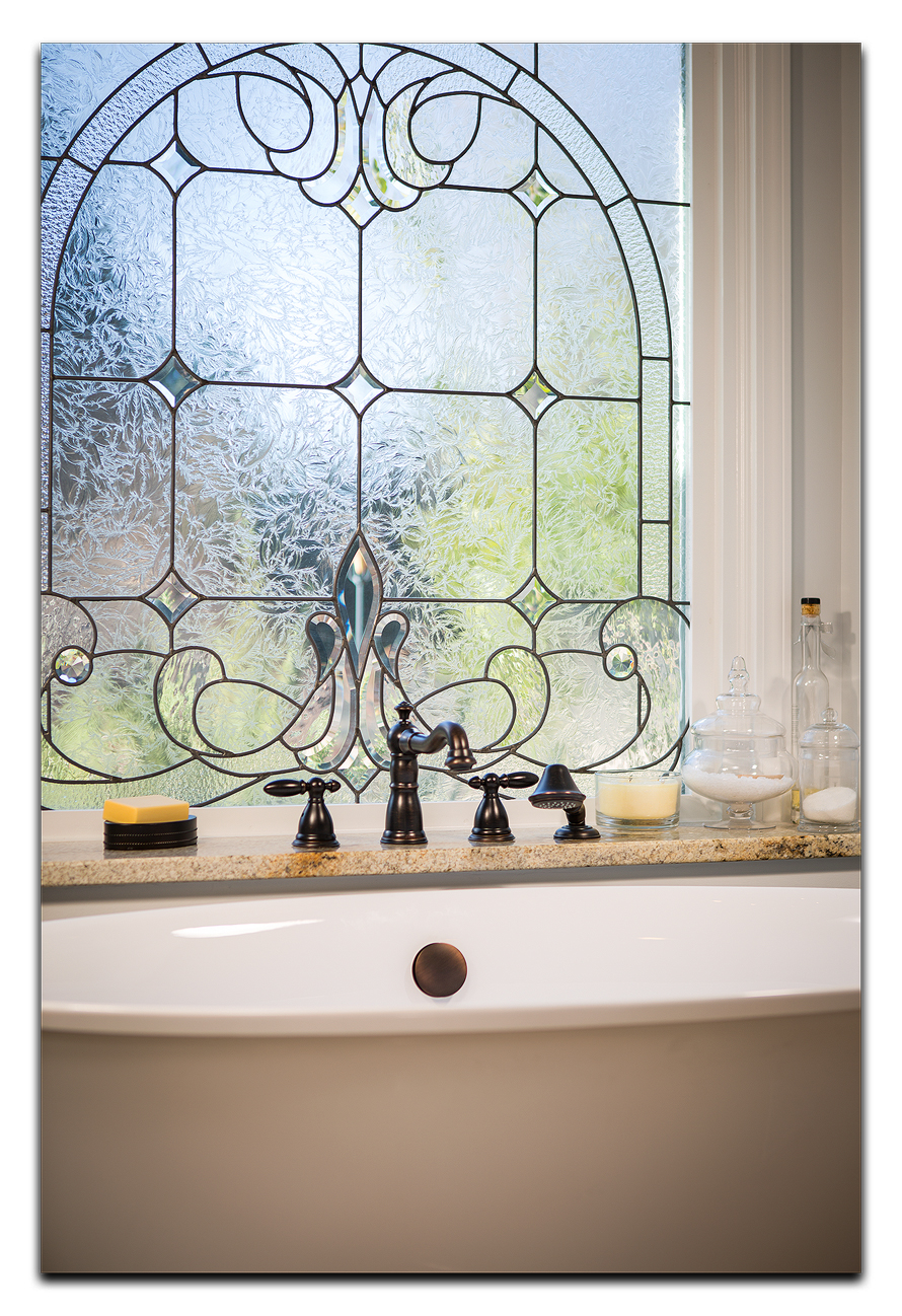
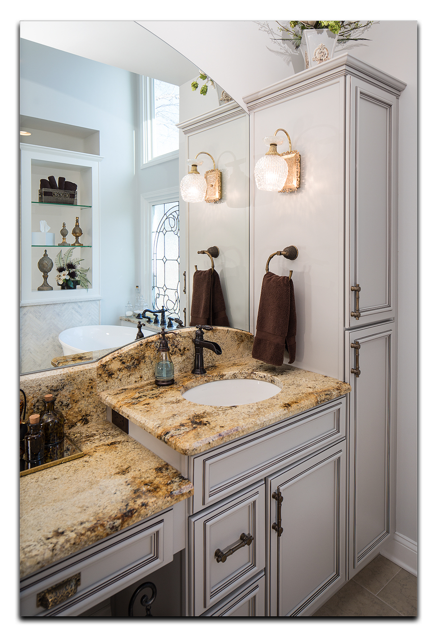
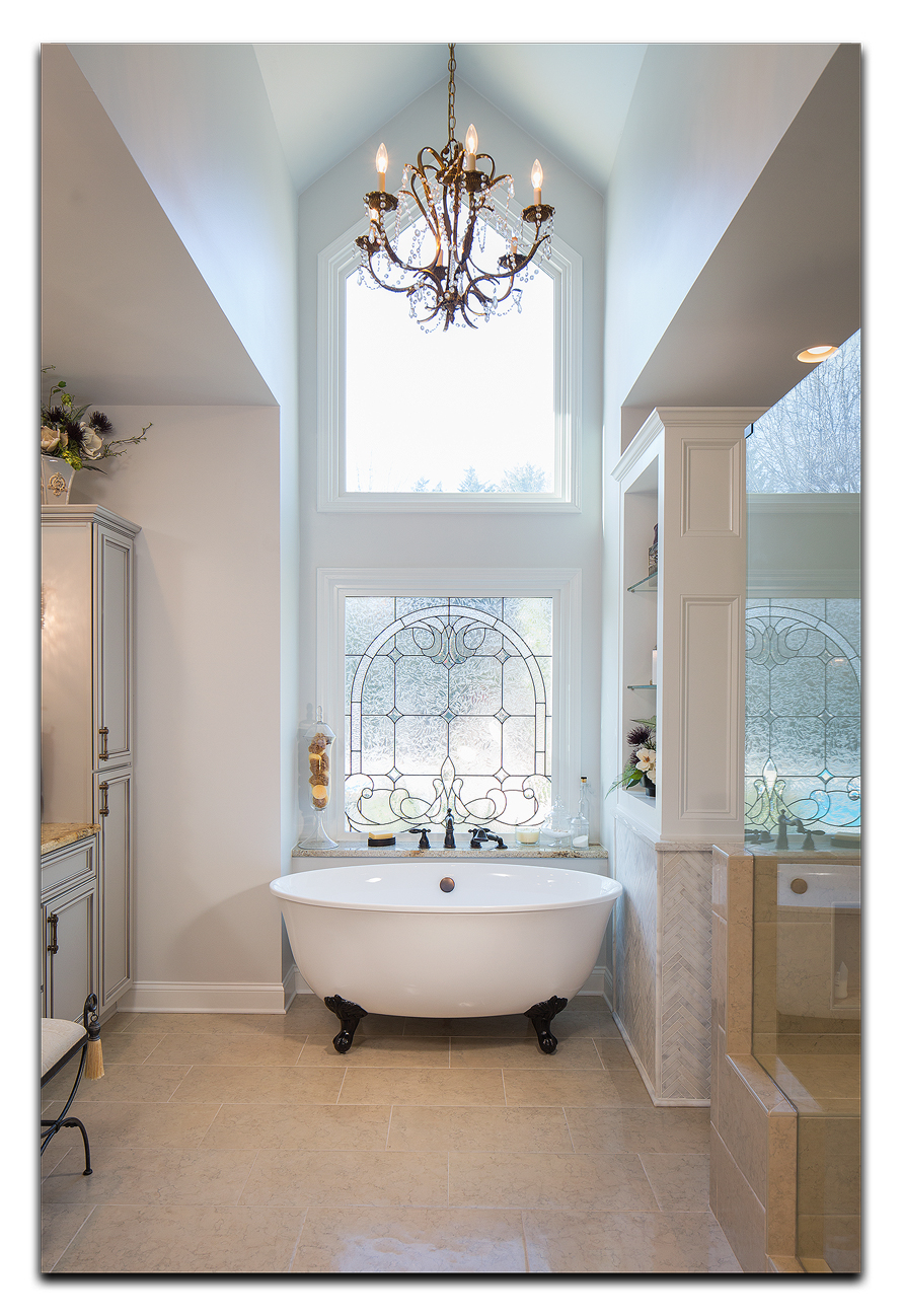
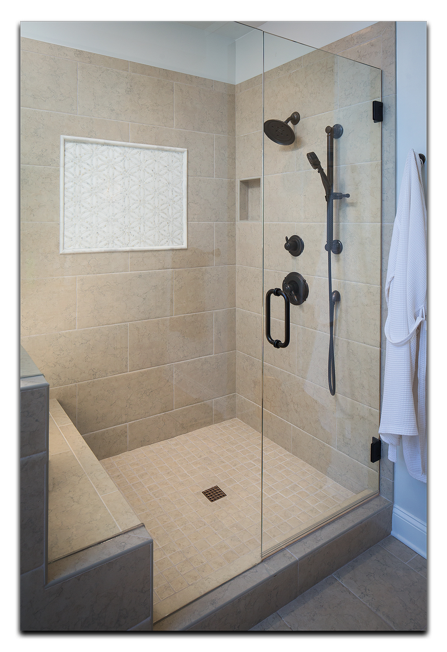
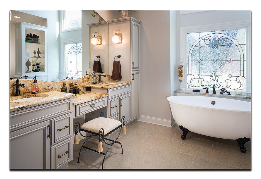
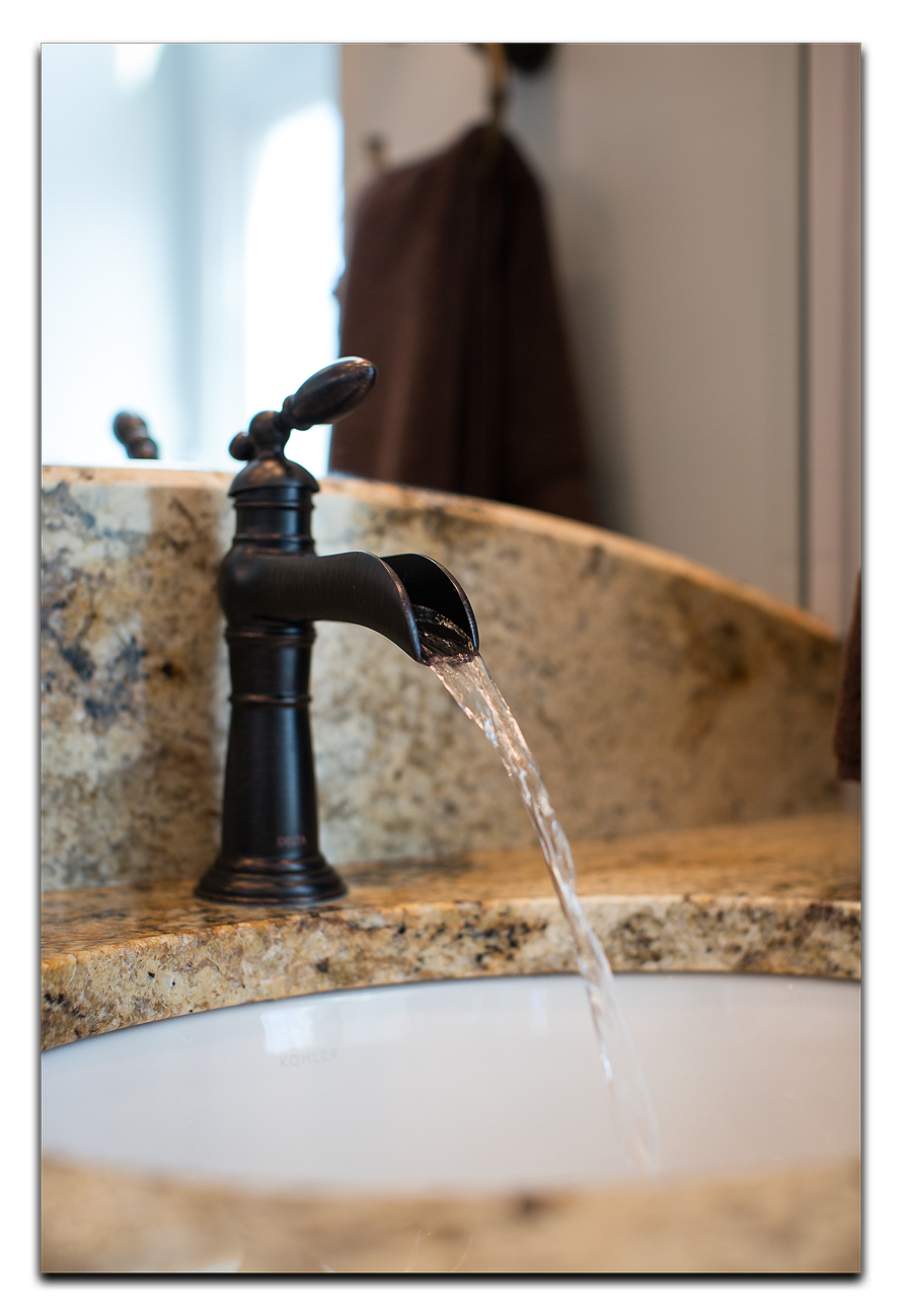
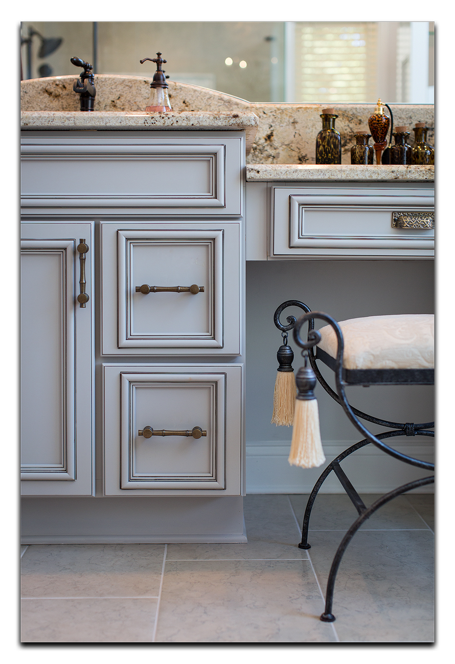
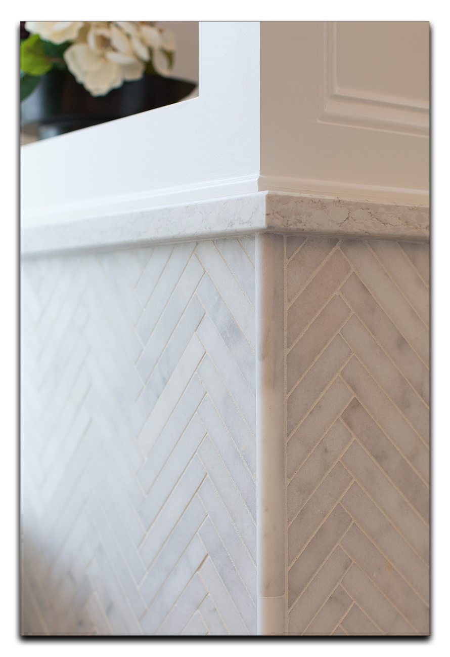
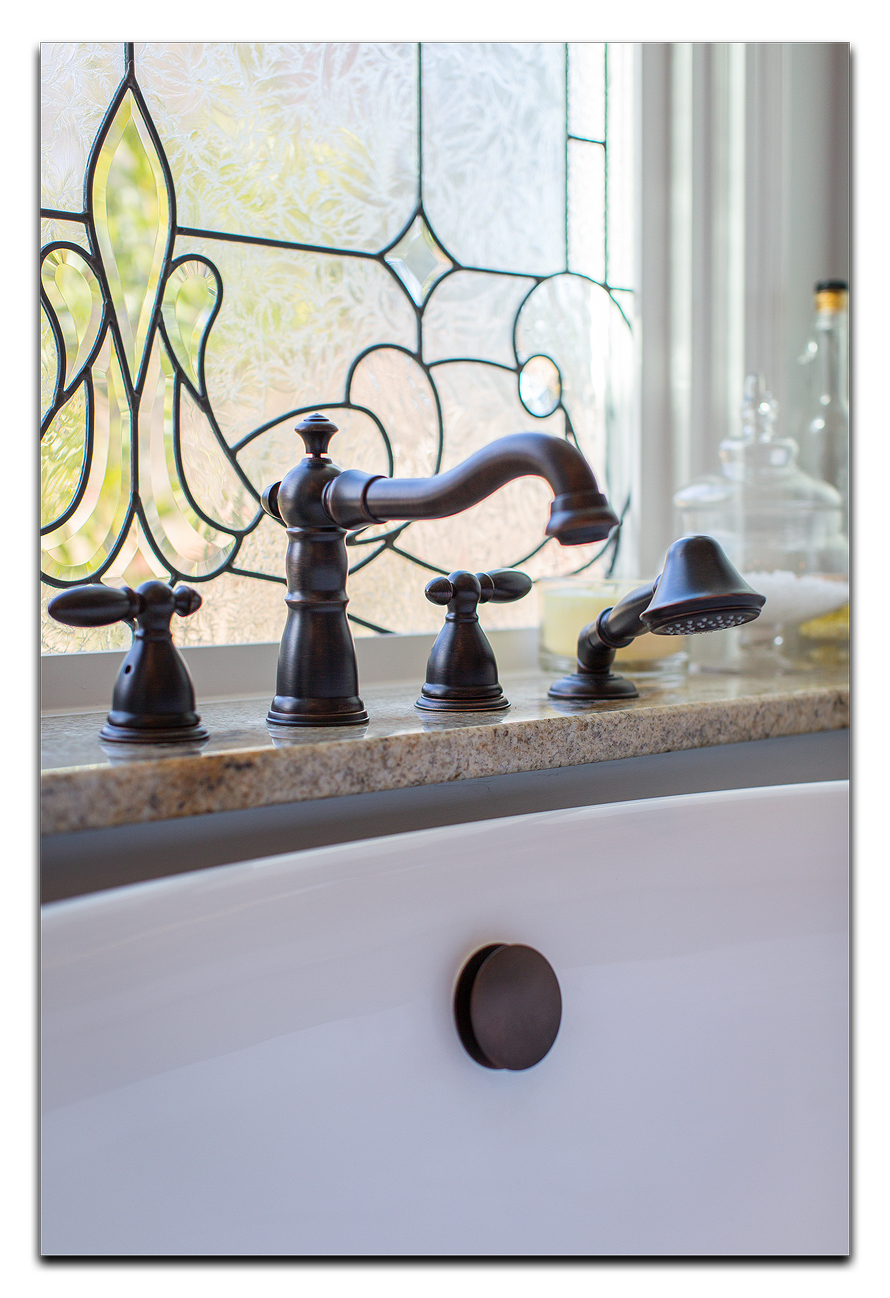
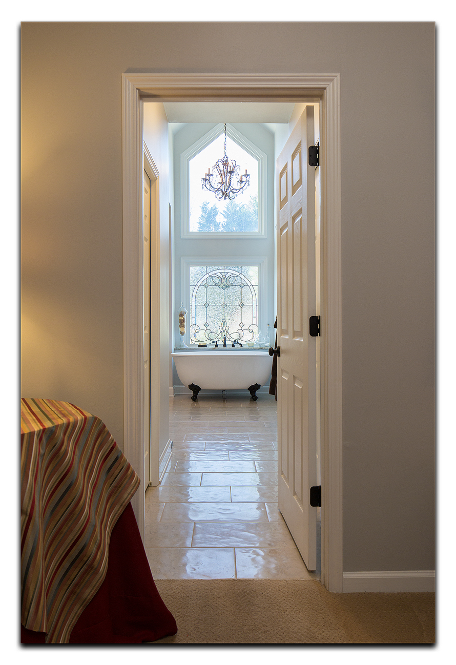
More and more, families are rejecting the ‘let’s just buy new’ mentality, and are investing in these older staple homes, and turning them into absolute gems. This describes a recent project by Kade Homes. This 1960’s ranch, turned into a contemporary treasure, was especially inviting to me, since I love ranch homes…
I think you’ll love it too! Let us know what you think!


We don’t often advertise it, but we do quite a few professional portraiture sessions for our clients. It isn’t a big part of our business, but it is a very enjoyable and often challenging part. But, to distinguish our portraiture for others’, we have tried to create a product that is not your typical ‘head in a box’ type portrait. Since the vast majority of our work is capturing stunning interior and architectural subjects, we developed a style that would fuse the two. Architecture and portraiture, you say? Yes, architecture and portraiture.
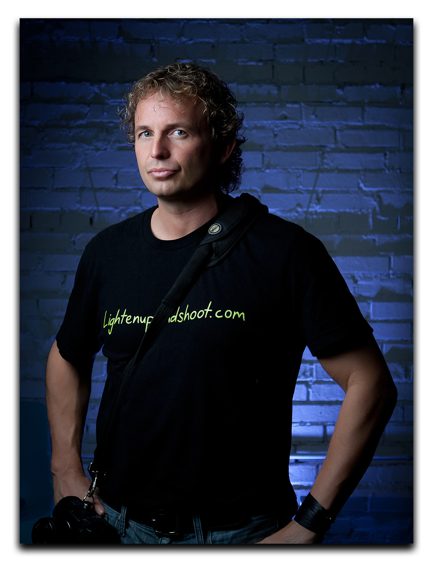
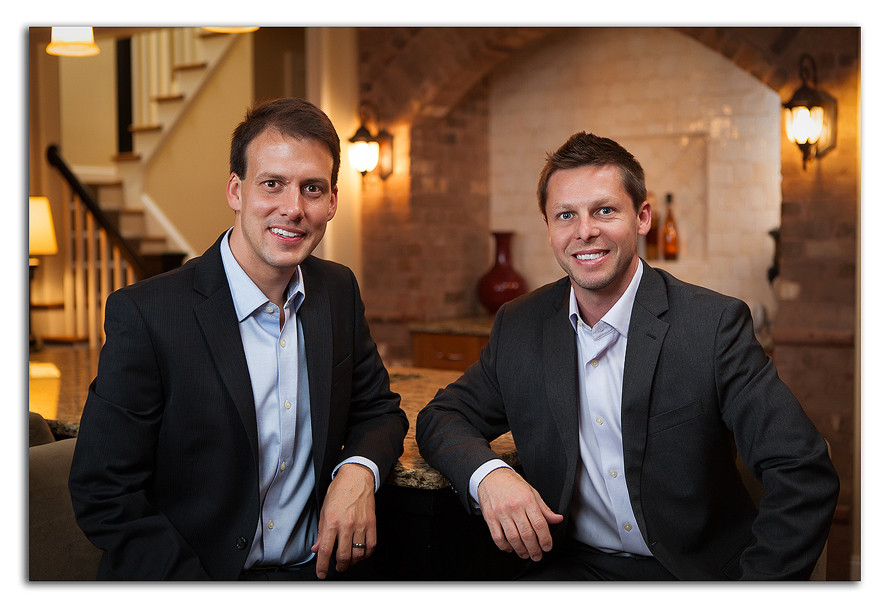
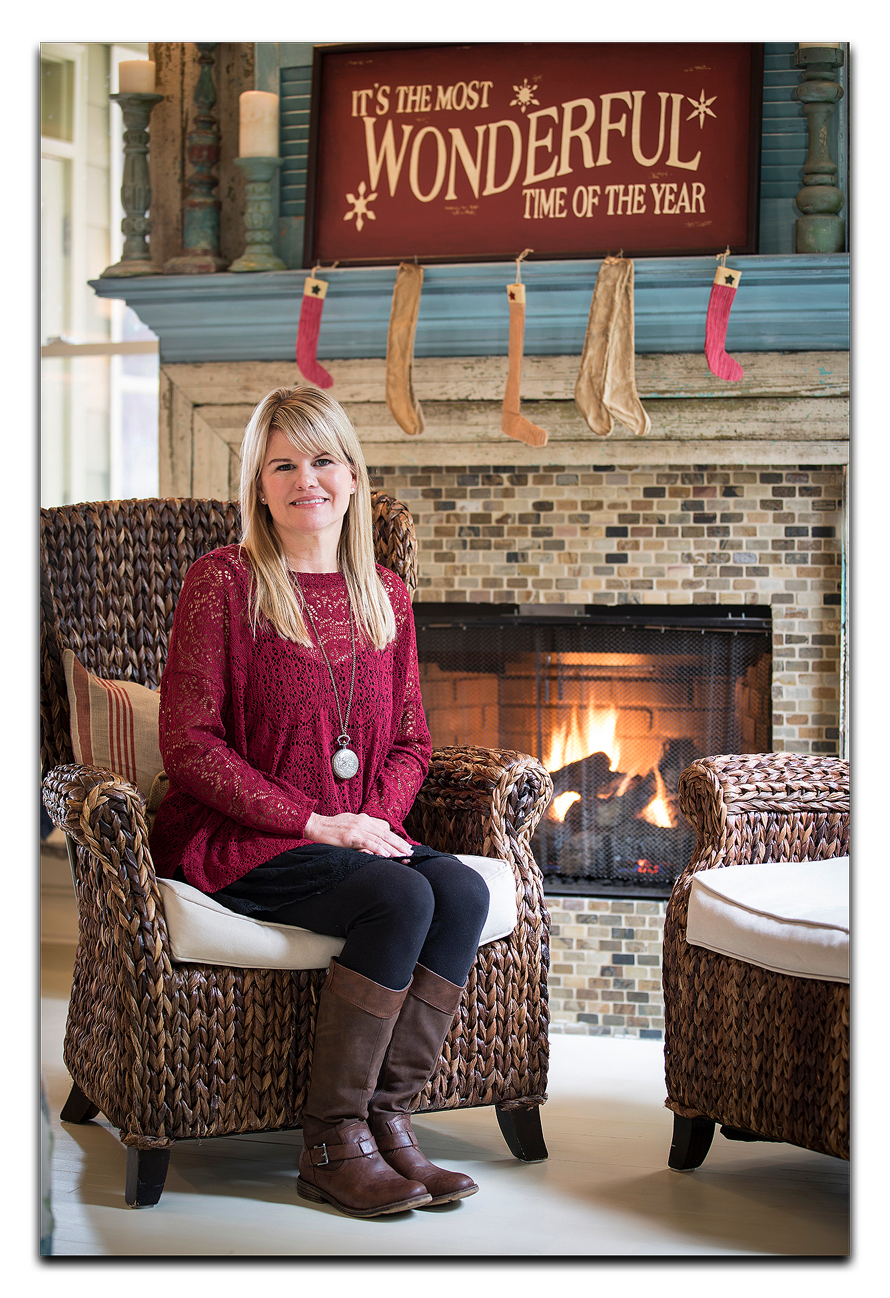
While our clients are the ‘subjects’ of our portrait images, we can use elements of interior design, architecture, and textures to bring more interest, more style, and more character to the final product.
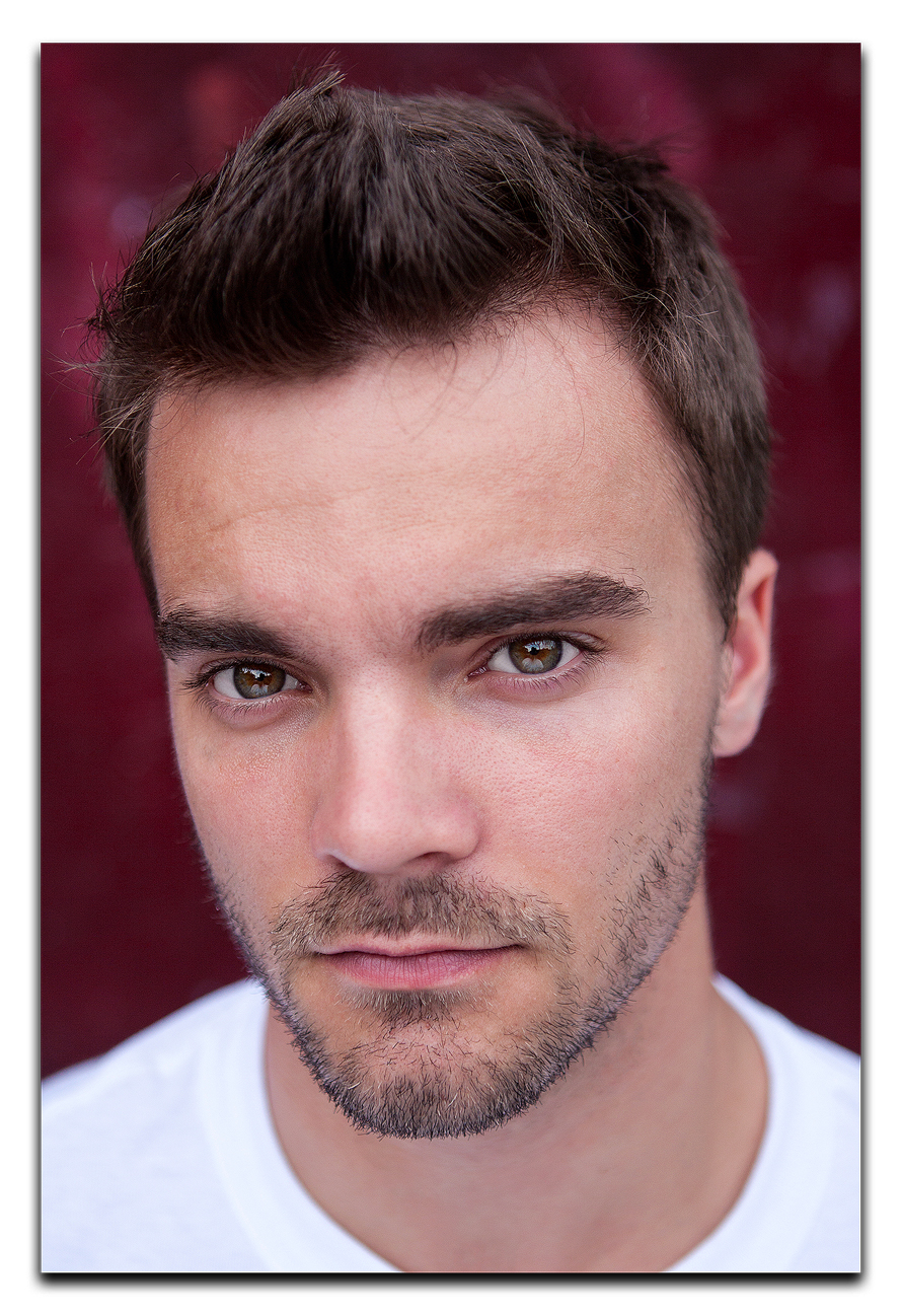
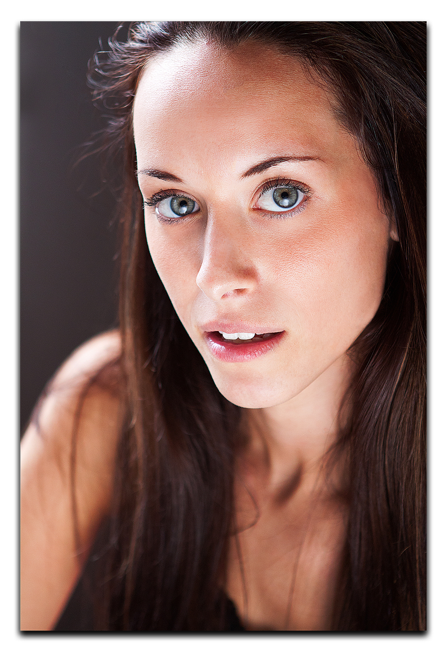
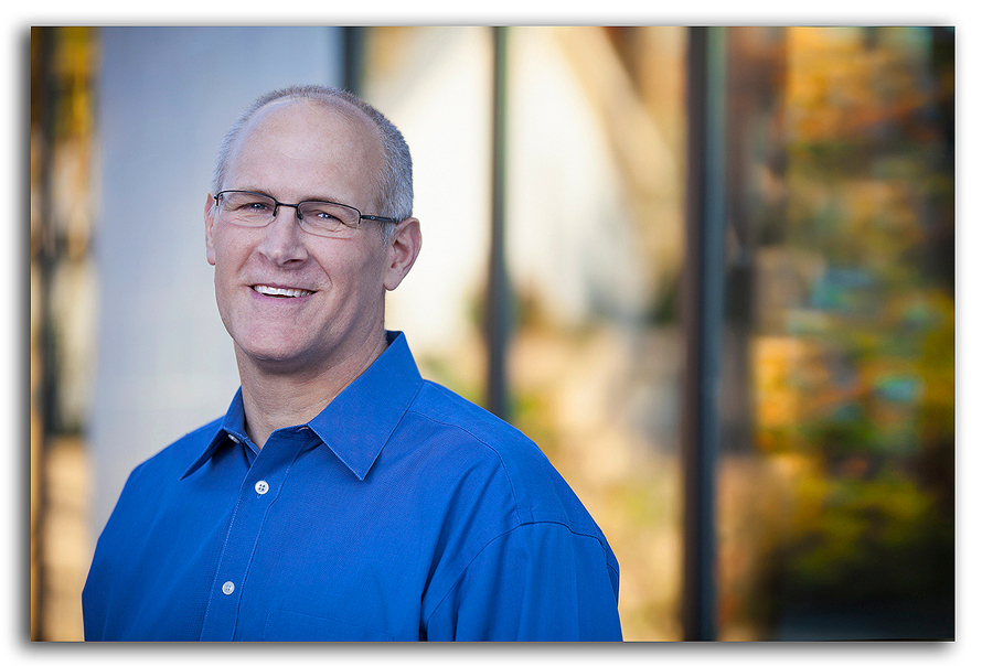
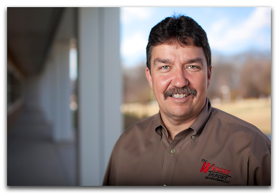
In contrast to this style, the two images we created below are what would be considered more ‘traditional’ styles of portraiture. This consists of a subject, and a rather ‘static’ background in terms of interest. Generally, these types are best used when only the face is of interest. Modelling and actors’ headshots are usually in this style.

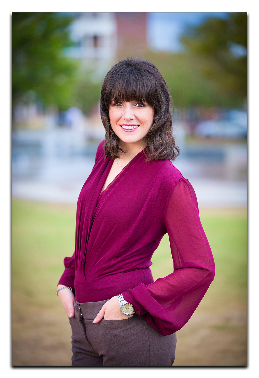
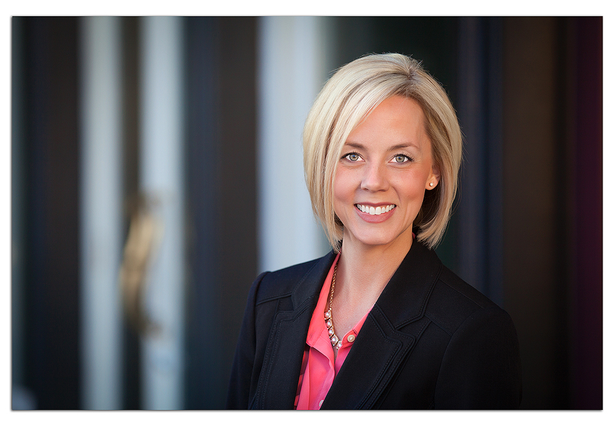
And here is an alternative style. These types of images incorporate elements from the surroundings to add to the final product. Generally, these surroundings add some dimension that is applicable to the ‘subject’. These may be textures in the walls, elements of the architecture creating ‘leading lines’ to the subject, or outright literal ‘environmental’ elements of the subject’s work environment.


The combinations of background environments and interesting lighting are virtually unlimited. These examples above incorporate the architectural and interior design elements, and they create a very visually compelling image. What do you think of this style? We’re always trying to stretch our creative output, so let us know what you think!
